Iceberg Organic Ice Cream
Iceberg exists to make indulgence honest. In a market full of confusing labels and artificial claims, the brand offers clarity through certified organic Ice Creams made from clean, transparent ingredients.
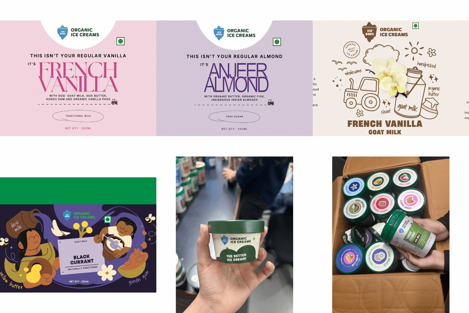
We partnered with Iceberg to shape this vision into a tangible experience by developing its brand identity, designing packaging for pre-filled cups, and creating the spatial design for its retail environment.
Iceberg believes that joy feels better when it is real, and that the simplest pleasures should be the safest ones to enjoy.
BRANDING | PACKAGING | RETAIL SPACE | PHOTOSHOOT DIRECTION

All categories
We used traditional farm boards, bills, receipts as inspiration to reinforce the organic and artisanal feel of
the brand. These patches represents brand’s rooted behaviour along with simplicity. Each product category (e.g.- real milk, vegan, sorbet, guilt-free, zero sugar) is represented by a unique patch shape. While the overall brand language remains consistent, the patch functions as a key identifier.
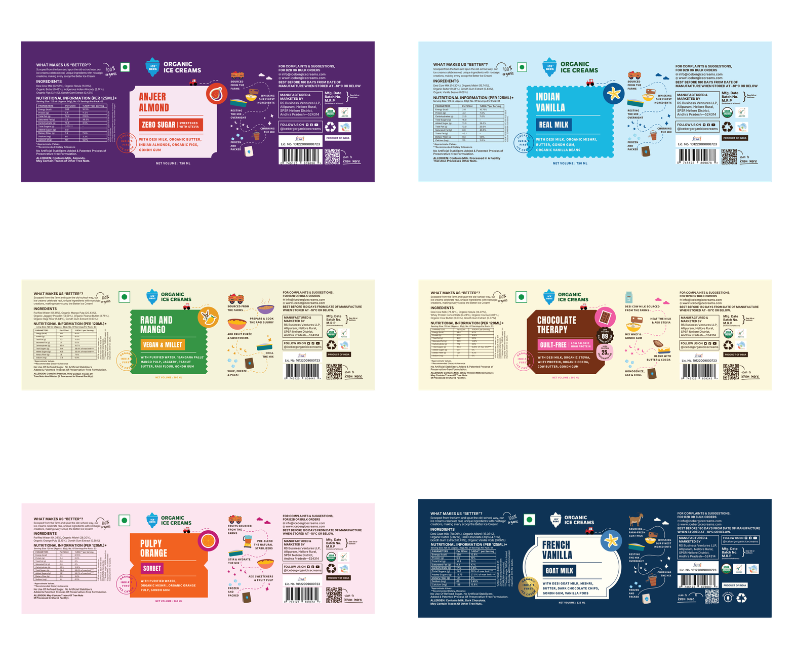


Zero Sugar
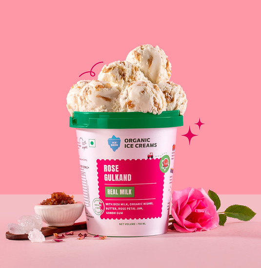
Real Milk


Sorbet

Vegan & Millet
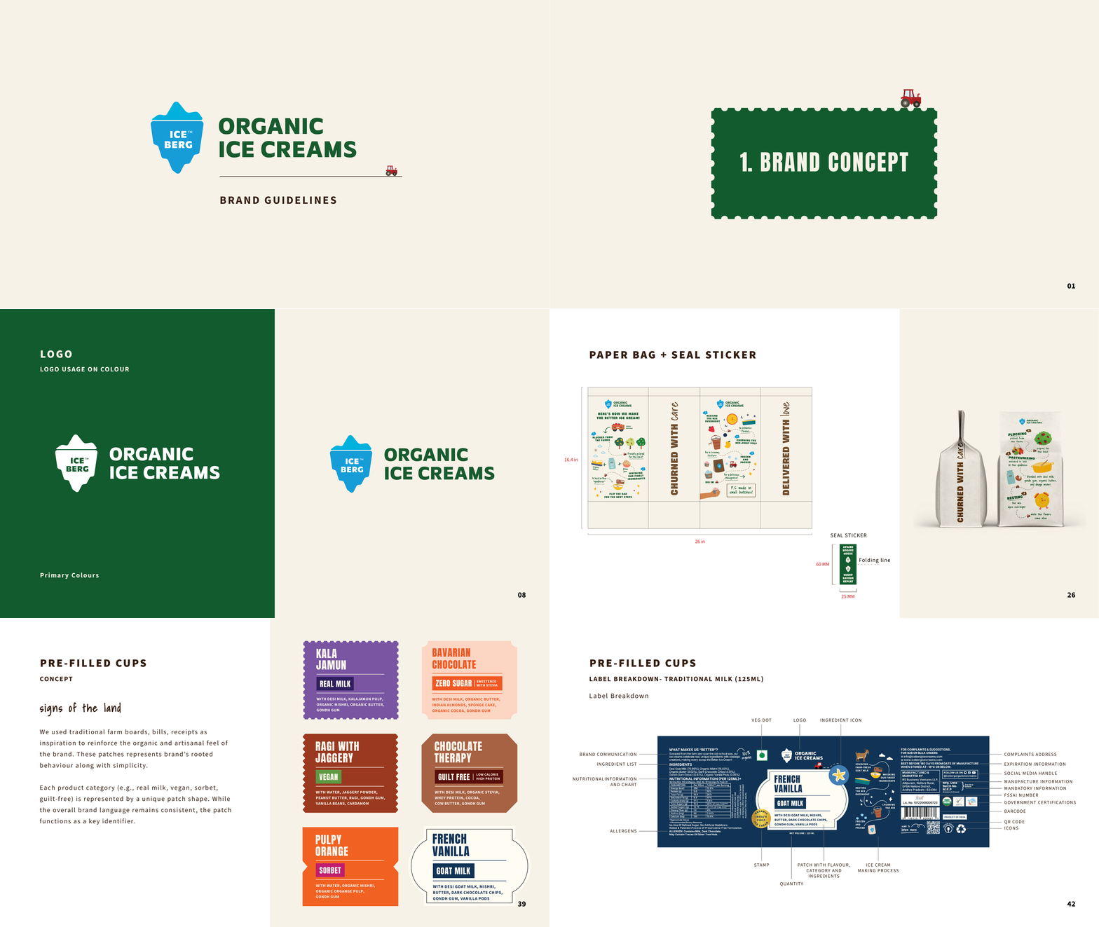
Brand Guidelines
The process